

Allen Institute for AI
"AI for the Common Good"
Project Overview
Research can be time-consuming, tedious, and frustrating. My role is to translate complex AI and NLP backend features into user friendly features and designs on Semantic Scholar. This includes the search experience, new feature design, and content explainability. During this role, I collaborated closely with product, engineering, research and data team to implement designs.
Semantic Scholar uses groundbreaking AI and engineering to understand the semantics of scientific literature to help Scholars discover relevant research.
Role
Product Design
Duration
6 months
Tools
Figma
Photoshop
Principle
1 | Paper Badging System
Overview
With over 190+ million papers on Semantic Scholar, it can be difficult to find the right papers. The goal of adding paper badges is to help users search faster and easier by quickly identifying various types of papers. The challenge is to design a system that is extensible, scalable, and responsive while not distracting users from their research.
Design Question
How might we help users browse through thousands of research papers more effectively?
Research Insights
After interviewing 5 researchers, we learned that:
Users find it useful to identify paper type before reading more about it (e.g. quickly identify that a paper is pre-print rather than peer reviewed).
Paper badges help users make decisions quicker (visually) on whether they should invest more time reading through the content.
Users prefer icons over shorthand letters on minimized badge design, even if users have to learn the new symbols.
Design Approach
Figure: I designed different variations of the badges and tested them against my requirements (extensive, responsive, easy to understand).
Extensible - The design has to accommodate for an ever-growing number of paper types and categories.
Responsive - The system has to be responsive, available on desktop and mobile experiences.
Harmonious - The paper snippet UI is visually dense with different types of information and text. Therefore, I chose to use a transparent background to blend in with the rest of the content yet using color and icon to draw attention.
Discernible - Since there will be more categories in the future, I chose to use color to differentiate between categories.
A/B Test
Next, I wanted to test 3 different placements of the badges because there are a lot of information on paper snippet UI. I was curious to see if certain badge placement can draw more attention and increase click-through rate of the paper.
After testing we learned that layout 2 has the highest performance because it follows user’s visual scanning pattern.

Final Design
The final design is an extensible, responsive, and engaging paper badging system that is available on desktop and mobile experiences. During our interview, users have expressed interest and curiosity to learn more about these icons. Internal users also gave positive feedback on the UI improvement to brighten up the search experience with colors and icons, compared to the previous text only UI.
Figure: In order to the extensible, I implemented a pill design that is responsive to the screen size, either showing icon or icon with text.

Figure: The design has been implemented and is now live on the website. Users are able to quickly tell high level meta data from paper badges.
2 | AI-Enhanced Paper Approval Feature
Overview
The goal for this project is to help authors automatically match papers that belong to them, using AI technology to scan author names on millions of research papers. The system will then add these papers to the corresponding authors in their author profile page. As the designer, I am responsible for designing user facing experience so that authors can review and approve papers that have been matched to their profile.
Design Question
How might we help authors quickly review system generated papers approvals while handling potential errors?
Additional research question:
How should we handle error?
How can we create more transparency?
Research Insights
There will be situations where ML output has a low confidence level. Therefore, we need to empower users to make the final confirmation.
Edge cases include authors with hundreds of papers to go through. We need to design a feature that is simple and intuitive.
Authors still prefer to have control over their papers. Therefore, we need to allow for manual changes on top of AI predictions.
Design Approach
Transparent - Users may feel confused regarding how papers are assigned to their profile and frustrated if wrong papers are added or removed. As a result, we need to transparent about the technology behind this tool and be transparent about potential errors.
Quick and Intuitive - New users may need to review hundreds of papers during their initial onboarding process. Therefore, we need to make this process intuitive, limiting unnecessary choices for users.
Feedback Loop - With ML models, it requires continuous feedback to improve and provide more accurate results in the future. As a result, we need to build a feedback loop into the experience to collect additional data.
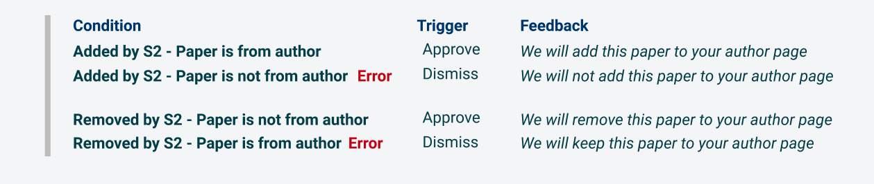
Error Handling - Since there is a possibility for error with outputs that have lower confidence level, we will need to map out different scenario (e.g. false positive and false negative).
Usability and Iteration
After conducting usability studies with different variations, we learned that users prefer a dedicated space to manage their papers, outside of their profile page. In addition, we found that reviewing papers can be daunting, especially with a lot of text. As a result, I simplified buttons into icons to reduce cluttering and reduced vertical width to decrease visual weight.
Figure: Adding the paper approval UI on author profile page. The trade off is with the limited space.
Figure: Moving the approval process to the settings section. However, users feel overwhelmed by too many buttons.
Final Design
The final design clearly indicates whether a paper is added or removed by our system. In addition, there is clear explanation on how papers were matched and what data source was used. The goal is to be transparent with our users with the intention of simplifying work for them.

Figure: Simplified paper approval process for authors to quickly approve paper changes with clear expectations.
The current design offers a clear system feedback and also includes a feedback loop to collect data on why our system recommendation was incorrect.
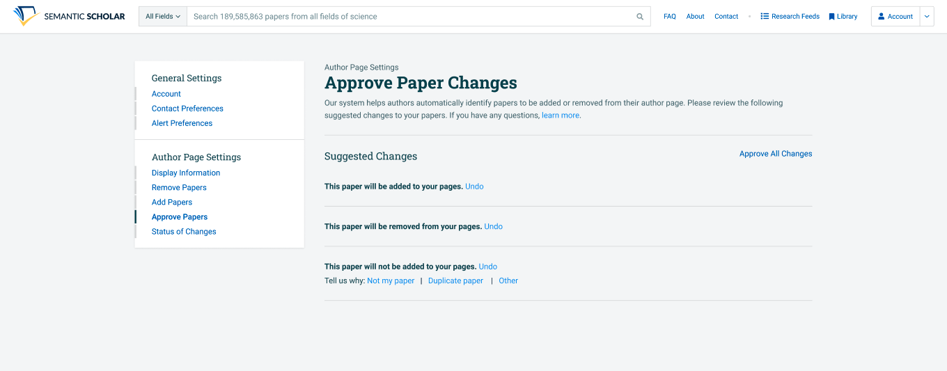
Figure: Design with built in feedback loop to improve ML model overtime.
3 | Other Projects
Searchbar micro interaction
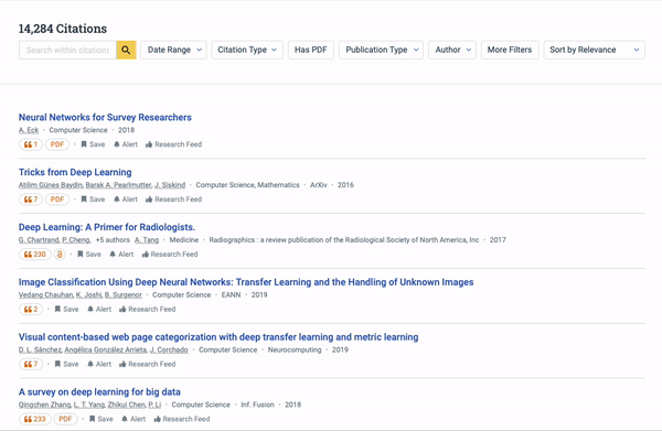
From our research, we learned that users find searching within citations really helpful. I restructured the search bar by moving the search tool to the front and to leverage micro interactions within a limited space. The search bar expands on click and the filter options collapse, creating a dynamic balance while allowing users to enter longer search queries.
Design Handoff
In order to minimize the discrepancy between design and final product, I have created a template for design handoff with detail annotations and redlines to communicate with engineers. This is accompanied with a design handoff meeting to walk through the design in more detail and answer any questions.

