come.unity App
“Redefining community service for students, schools, and organizations”
(2018 Seattle EDU Startup Weekend - 1st Place)
Problem Space
With the current community service process, the experience has become a burdensome chore for students. Students feel like it is a checklist obligation for college applications; on the other hand, schools and organizations are overwhelmed by the amount of paperwork required.
Design Solution
come.unity is an engaging community service app for students to discover volunteer opportunities based on interests and group activity. Our goal is to help students feel involved, engaged, and recognized for their work.
Challenges
The startup weekend follows a 54-hour hackathon format so time management and meeting deadlines were crucial. Teams were formed at the event based on our topic interest and we have work closely together with our team members, from different background, to create an educational solution and prototype by the end of the event.
Role
Lead UI / UX Design
Product Design
Duration
54 Hours
Tools
Sketch
Marvel
Team
Sierra, Nicole, Sam, Kent, John, Sri
Award
1st Place - Seattle Startup Weekend
1 | Design Question
“How might we help students find meaning and interest in community service experience without feeling like a chore?”
2 | User Research (Student Interviews)
We interviewed both students and teachers on their current attitude towards the community service process. We discovered:
Students would like to choose a community service opportunity that match their interest
Students would like to learn about detailed description and requirements for the event prior to signing up
Students would like to know if their friends are going and they would like to participate with their friends
Students would like to know their impact and contribution to the community
Persona
3 | Ideation & Sketching
During our ideation stage, we came up with possible solutions such as a directory for all volunteering opportunities, job posting site for organizations to find volunteers. After team evaluation, we decided to create a marketplace platform that match students with volunteer opportunities. The solution would benefit students, schools, and organizations and create an all-in-one space for volunteering related tasks. My role was to help facilitate discussion and develop the user flow and sketches.
User Flow
Paper Sketch
4 | Prototyping
Brand Direction
In approaching this app design, I chose colors that are fun, positive, and energetic. Since the target audience is for high school students who have a high usage of social media apps, I wanted to go in the direction of a clean and minimalist UI. Our preconceived thoughts of digital educational solutions are usually boring and outdated, therefore a bright and minimal UI can bring the product closer to our target audience.
I decided to keep the background clean in order to reduce sensory overload while browsing because users will spend time reading through the event description. The primary green color is used on all key elements and buttons. Notifications and other elements that are time-sensitive or newly updated are in red to draw attention from the users.
High-Fidelity Prototype
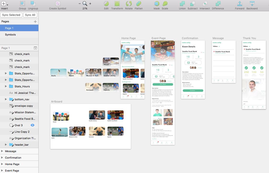
I was in charge of designing the overall UI and interactions for this app using Sketch. Then, the assets are handed over to the engineer to develop the final prototype presented.
5 | Design Solution
Key Design Elements
6 | Interactive Prototype
7 | Judges’ Comments
“Sophisticated, thoughtful, clean execution.”
“Nice prototype - attention to good UX”
“Finding meaningfulness for community service is very important due to potential impact.”
8 | Current Stage
Currently, our team is meeting with educators and staff from the Seattle school district to validate and solidify our business model. We are hoping to gain support from a few high schools in Seattle to pilot the app. Our goal is to help schools reduce friction and paperwork, help organization bring on more volunteers, and most importantly, help students find passion and recognition in their service.


